7 Best Color Schemes for Family Photos
Choosing the wrong colors for family pictures can lead to distracting images and clashing outfits. I’ve been taking family portraits since 2001, guiding several families in selecting the ideal color palettes. To help you achieve professionally styled portraits, I’m compiling the best color schemes for family photos.
Best Color Schemes for Family Photos
When choosing colors for family photos, match the setting and season: soft pastels for spring, tropical hues for summer, warm earthy tones for fall, and reds with grays for winter. Pastels suit beach scenes, earth tones complement parks, and deep neutrals with hues of gray and yellow benefit urban settings.
Knowing which colors to embrace or avoid is one of the keys to achieving the perfect picture. During our planning, I’ll guide you in choosing the right color palettes to make your family pictures more visually appealing and memorable.
| Theme | Color Scheme |
| Spring | Soft pastels and light neutrals |
| Summer | Bright, tropical tones like sky blue, lime green, yellow, and red |
| Fall | Warm earthy tones like olive green, terracotta, mustard yellow, and beige |
| Winter | Bright reds, cool grays, icy blues, and crisp whites |
| Beach | Pastels, turquoise, peach, and light neutrals |
| Park | Earthy tones (tan, olive green, mustard), soft blue, navy, and mauve |
| City | Deep neutrals (charcoal, burgundy), sky blue, mustard yellow, and light grays |
1. Soft Pastels, Light Neutrals, Turquoise, and Coral Tones for Spring
Soft pastels and light neutrals blend beautifully with nature during springtime, making your photos pop. Here are some outfit ideas that work well with this palette.
- Adults and parents: Pale pink shirts, beige trousers, or skirts with coral sweaters.
- Kids: Mint green dresses or shirts, paired with white shoes.
- Teenagers: Light blue jeans with a turquoise top with coral accessories.
- Grandparents: Soft beige cardigans with pastel shirts or blouses.
2. Bright, Tropical Tones for Summer
Bright, tropical tones capture the warmth and energy of summer, making your photos pop with vibrancy. Consider the following clothing ideas to bring these tropical tones into your family photos:
- Adults and parents: Sky blue button-down shirt paired with khaki shorts or a lime green dress with bold, colorful accessories.
- Kids: Lime green t-shirts, denim shorts, sky blue sundresses, red sandals.
- Teenagers: Red tees with yellow shorts or a casual summer dress in sky blue.
- Grandparents: Elegant yellow blouses paired with tailored trousers, and red cardigans over a light summer dress.
3. Warm Earthy Tones for Fall
Warm earthy tones like olive green and terracotta are versatile hues you can easily pair with other colors. Mustard yellow adds a pop of color to stand out in fall backdrops, while beige serves as a neutral base. Here’s how I usually incorporate these clothing colors in family photos:
- Adults and parents: Olive green jackets, terracotta scarves, mustard yellow dresses or polo shirts.
- Kids: Mustard yellow sweaters, olive green pants, beige boots.
- Teenagers: Terracotta hoodies, olive green beanies, beige leggings.
- Grandparents: Beige cardigans, mustard yellow vests, terracotta shawls.
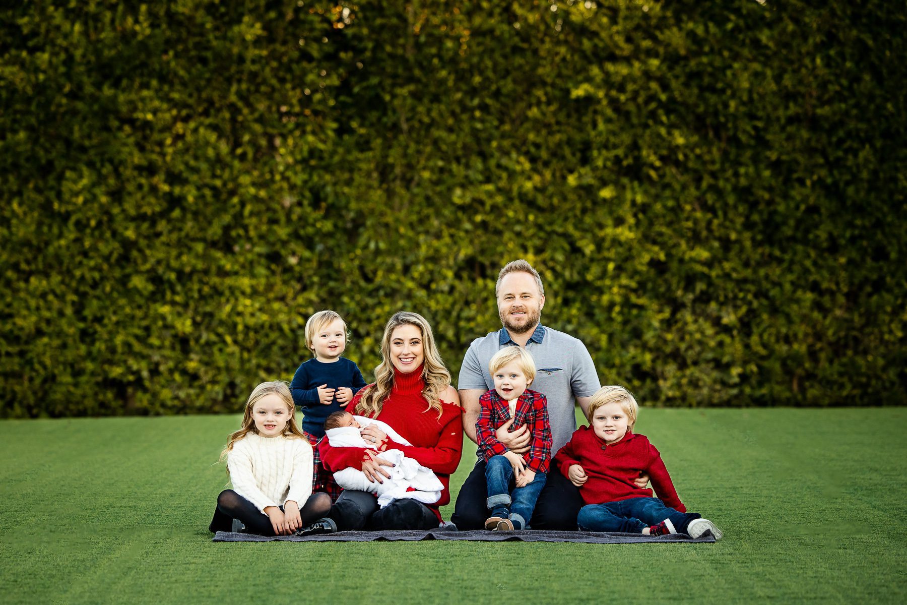
4. Bright Reds, Cool Grays, Icy Blues, and Crisp Whites for Winter
People love snow because it prompts an almost childlike sense of free-spirited fun. As your family has fun during a winter shoot, the right colors can draw attention to you while adding a touch of warmth in this cozy season.
- Adults and parents: Red coats, gray cardigans, icy blue scarves, white turtlenecks, gray pants.
- Kids: Blue snow pants, red mittens.
- Teenagers: Gray hoodies, white beanies.
- Grandparents: Icy blue vests, cozy red wraps.
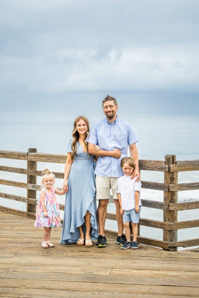
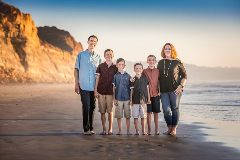
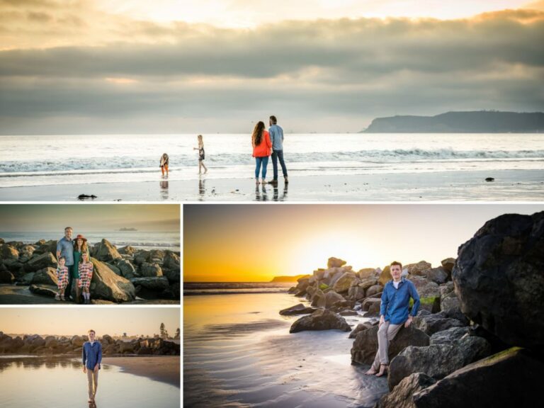
5. Pastels, Turquoise, Peach, and Light Neutrals for Beach Sessions
When dressing up families in some of the best beach photo shoot locations in San Diego, I usually opt for pastels and light neutrals that bring a pop of color while looking calming for the setting. Here’s what I recommend to make families look stunning against sandy beaches.
- Adults and parents: Flowy pastel dresses for women and light linen shirts with beige shorts for men.
- Kids: Pastel pink dresses, light blue shirts with white shorts.
- Teenagers: Stylish peach romper, turquoise T-shirts with jean shorts.
- Grandparents: Soft neutral blouses and skirts, light beige pants with pastel shirts.
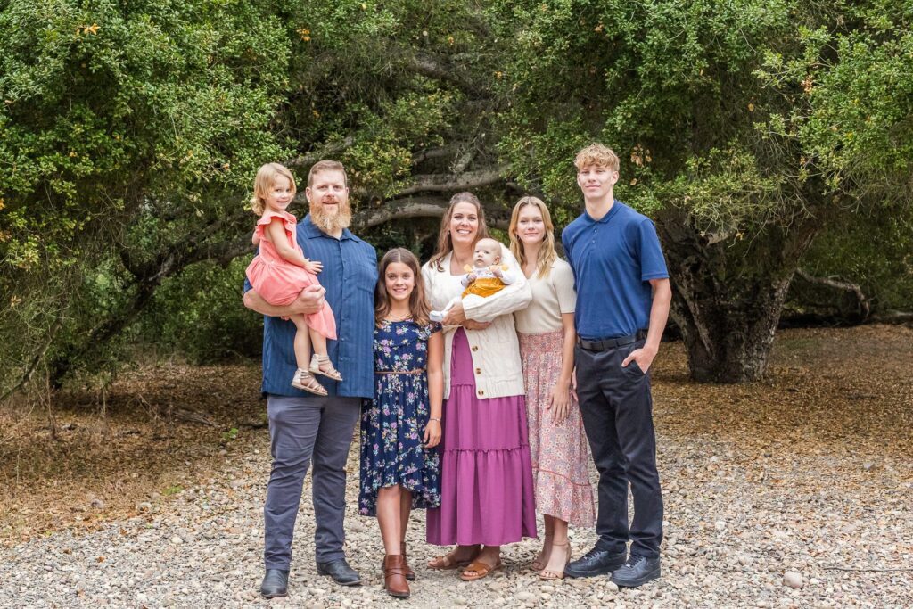
6. Earthy Tones, Soft Blue, Navy, and Mauve for Park Photo Sessions
Earth tones evoke feelings of comfort and stability – values that are also important in families. Here’s how you can make earthy tones like tan, olive green, and mustard blend well with natural settings.
- Adults and parents: Olive green shirt paired with tan trousers or a navy dress with mauve accessories.
- Kids: Mustard-colored tops or soft blue sweaters, tan shorts, or olive green skirts.
- Teenagers: Navy hoodies or tan cardigans, styled with jeans or mustard pants.
- Grandparents: Soft blue blouses or olive green sweaters, combined with classic tan pants.
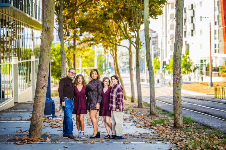
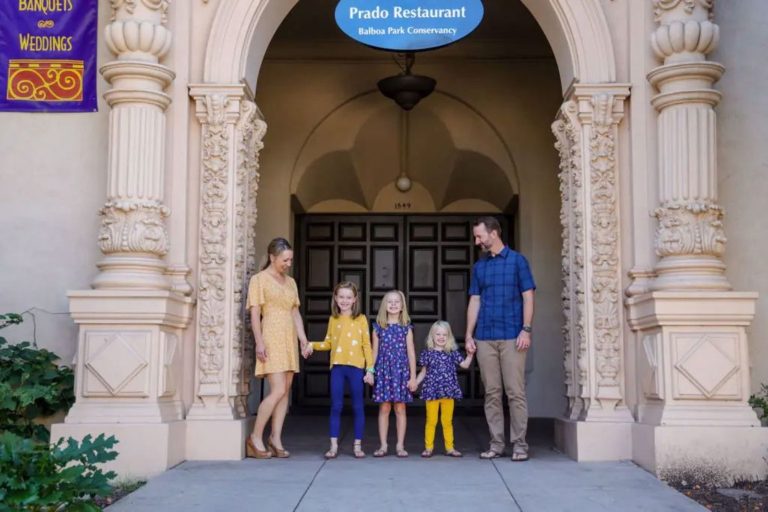
7. Deep Neutrals, Sky Blue, Mustard Yellow, and Light Grays for City Photo Sessions
Deep neutrals like charcoal and burgundy work well with sky blue, mustard yellow, and light grays, complementing the urban settings and bringing out the best in a metropolitan backdrop. Bring this mix of colors into your wardrobe for a timeless ensemble:
- Adults and parents: Sky blue tops, light gray trousers, burgundy dresses, with mustard yellow accessories.
- Kids: Mustard yellow jackets and charcoal pants.
- Teenagers: Burgundy hoodies with light gray jeans.
- Grandparents: Light gray sweaters with charcoal or burgundy slacks.
Related Questions
How to Use Color Relationships in Choosing What to Wear?
Color relationships create visually harmonious outfits by understanding how different colors interact on the color wheel. For example, triad colors, such as red, yellow, and blue, form a triangle on the wheel, providing balance and contrast. Meanwhile, analogous colors, like green, yellow-green, and yellow, sit next to each other, creating a serene and cohesive look.
How to Choose the Right Color Palette for Family Portraits?
Choose a color palette by considering your individual skin tones, the planned photo shoot location, and the mood you want to convey, which might range from soft and elegant to lively and playful. Select two to three base colors that complement each other and then incorporate neutral tones to balance and ground the complete look.
What Colors Should We Not Wear for Family Photos?
Avoid wearing plain, bright white, which can create harsh glares and wash out skin tones. Steer clear of neon or overly saturated colors that can distract from faces and create visual chaos in family photos.
Conclusion
Don’t miss the opportunity to create timeless, beautifully curated family memories through expert color coordination and professional styling. As your family photographer, I will provide a personalized, color-perfect photo session and turn your family’s story into a work of art you can pass on to generations.